So here's a question - how much should a team jersey stand out?
We see examples across all sports, but let's look at a couple examples from the keepers today from 2005-06 Upper Deck Victory.

The black and purple Kings uniforms are slick and nice, but those yellow and purple's - bright! Do you like these and how much they stand out, or do they become an eyesore? Does it matter if it is "your team" versus being another team in the league. For instance, as a King fan, I'll like it as I stand behind my team in all their bright atrocious choices?
Similarly, I like the Wild's green uniforms, but the red stands out too much to me. Not sure why I see it being harsher than say the Montreal uniforms, but to me it is.
I am not enough of a colour aficionado to tell you if it is a slightly different red or not, but it seems like it to me.

Nashville's colours here - what I have heard referred to nicely as dirty mustard, or not so nicely as a baby's number two, just too much again for me, but the dark/navy blue is pretty nice.


No other real offenders in the bunch - even the orange for Philly, I can live with. I know we can't have all teams in blue, black, white, as it just wouldn't work well to differentiate - but should there be a limit? Will we be seeing a neon green or glaring pink used as a primary colour for an alt jersey soon? I shouldn't speak too loudly as of course they use the pink for October (for an amazingly worthwhile cause, and I am completely for the use and assisting in bringing attention to a worthwhile cause), is it just time before the draw all the time by using such a bright colour for all occasions happens?
Dupes to end...


I'll end today with another trade - this one with TCDB member AirPete. I've done a few trades with him before, great guy and great cards, and no different here.
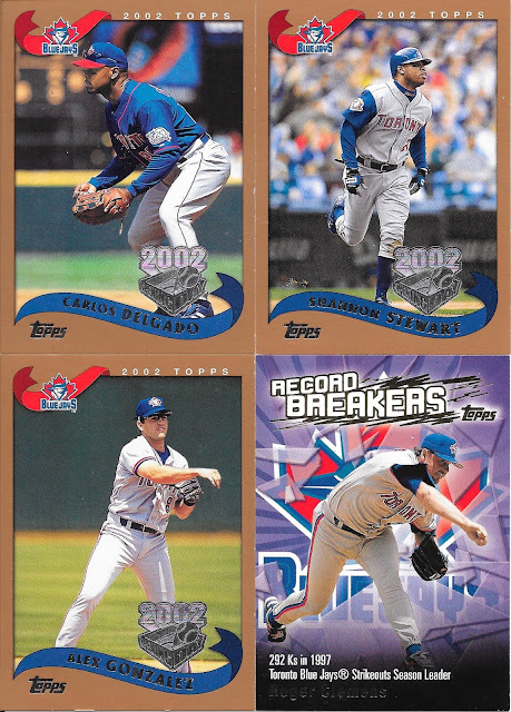
Jays heavy in this one, and that's a good thing! Remember when Opening Day had that massive silver logo compared to the relatively speaking, small one in comparison we have today? One good change for Opening Day as a brand at least.
Roger Clemens with a great season in Toronto and I like the card mentioning his 16ks against Boston...heh.

A theme with some of these is variations. John Olerdu is the dark back variation from 1991 Topps.
I will say Alex shouldn't have technically been on my want list as I consider the Ted Williams card a minor league one, but it is a card I need for that set, so all good.

More variations! So these were needs between the Inc versus Inc. and *Denotes versus *Denotes* differences. All in, I still need a handful of variations, but now I am much closer!
Pre-stardom Fielder is a good get.
ReplyDeleteI guess it depends on the sport. I like black for football and hockey, but not for baseball. Sand (desert?) would work for baseball, but might be too boring for football.
Not a fan of yellow. Red can be a complementary color but not a dominant one.
Looking at those Flyers cards, orange works a lot better as a complementary color than a dominant one.
I didn't know about the Inc and Denotes variations. Which is rarer?
ReplyDeleteA great question - though I'm not sure I've seen a clear answer. From my own experience, I can't say as I collected the cards over the years, didn't know until fairly recently, and in going through them I had a smattering across each variation. So - long answer short - I don't know.
Delete