Well, here is something that isn't hockey, but is another nice bunch since this is one of the flagship baseball sets from Topps that I would like to actually collect, but don't have a bunch of. At least after today, I have a little bit more!
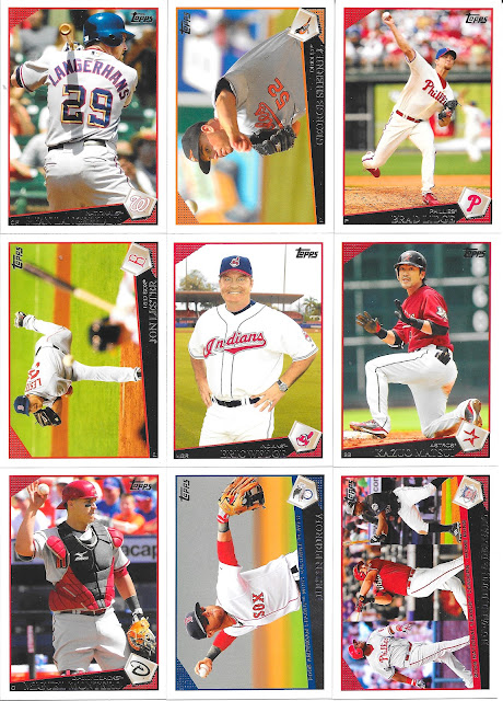
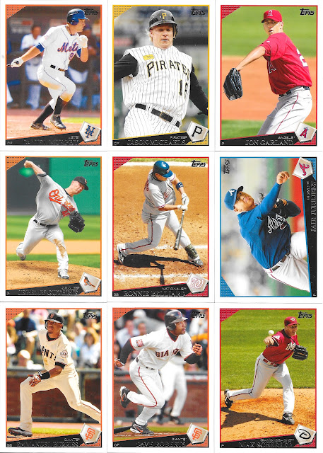
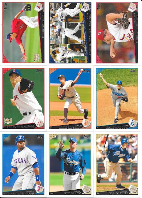
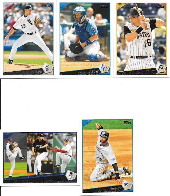
I think my only complaint on the front design is the foil, and that's just because my vision makes it harder to read the foil on black. That said, I like the white border, the minimal impact of the name banner, the simple home plate logo stuck on the front, and the discrete Topps logo positioning, all makes for a nice looking card.
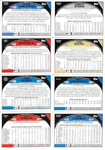
Heck, the backs are pretty great too. Personally, the card number font could be slightly better, and the curved info line across the top isn't ideal, but full stats, nice write up, easily laid out and a nice read otherwise - I like it!
There may not be as many excellent photos as say a Stadium Club, but there are still some standouts to me at least. Ronnie in the centre is one standout as I just like the different overhead angle shot.
We even get a couple of Jays cards with Halladay and Bautista. If you are getting a couple Jays of the time, that would be the two to get!
No comments:
Post a Comment