You probably either like or hate the front design of 2008 Topps flagship.
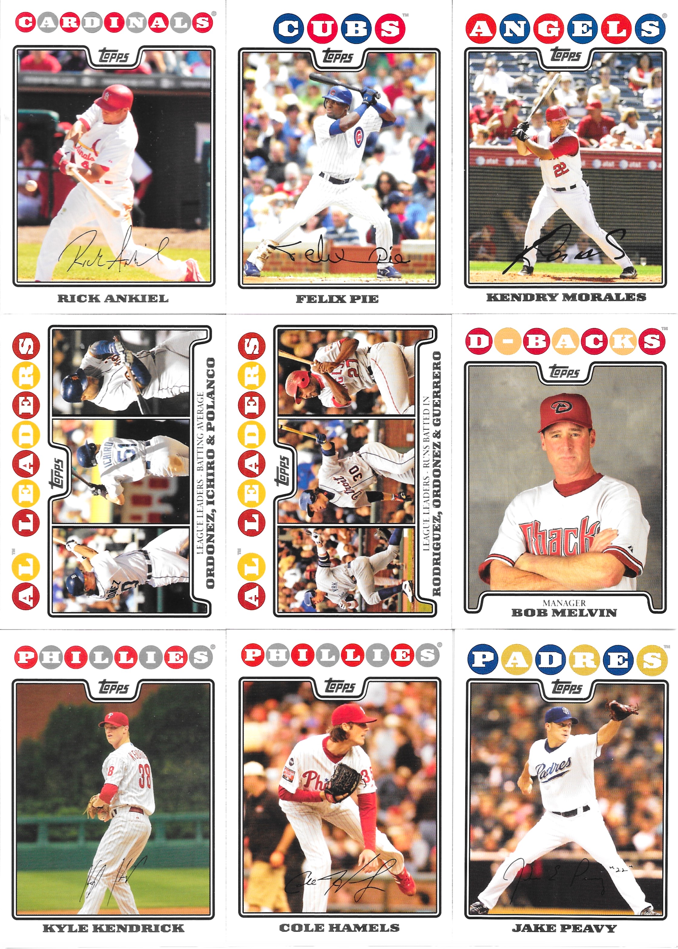
The balls team name design definitely stands out. Personally, I like it, mostly because of the team colour use and it's easy to see and recognize, but I can get people not liking it as well. Definitely a preferred design taste.
Wither way, it does help to make the 2008 year design stand out. 2008 Topps is also a set on my slow build because, in part, of the design. The Topps logo intrudes a little bit, but at least the placement is the same every time, a bit different from the "hide it in a corner within the photo" used most years.

As I don't have much of the set, we get an all addition day here, yay! When we get to include The Hoff - no, not THAT Hoff, the one here, Trevor, that's pretty cool too.
Though Mike Piazza as an A - just doesn't ever look right.

Design wise - I can live with the White Sox balls being black and grey...I mean, should have white in there somewhere, but that doesn't really work, so a good adjustment there.

We end with one error card addition, and that's all for now.
I'd probably chalk this set up as one I collect almost just because of my like for the design - what set do you collect because of the design (only - or mostly because of it)?
For me it is the best Topps (design) set of the 21st century.
ReplyDeleteIt has its flaws that you allude to but ifs like something from the 70s. A slight recreation of the 1972 Topps sets
2000-2003 - Color borders with 2003 a decent takeoff of 1983 and 1963 Topps
2004-2005 - Prelude to the 2008 set, a lot of white borders, some design, small photos
2006 - A nice unique set probably 2nd best Topps set of this century
2007- A bad take off of 1971 Topps
2009-2014 - White borders, big photos decent design, same
2015 - getting rid of the white borders and prelude to borderless
2016-2020 The border less era - ok
2021-2022 - White borders smaller photos - ok
I really like it, wish I had more of the NBA set.
ReplyDeleteI didn't dislike it, but seeing them all scanned together over a white background has me reconsidering :O
ReplyDeleteI love the 2008 design. I wish I had built the entire baseball, football, and basketball sets when they were more affordable.
ReplyDelete