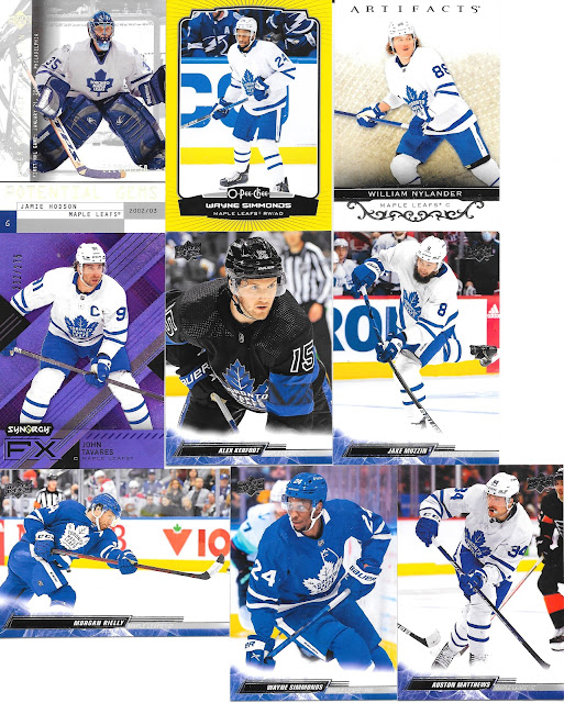
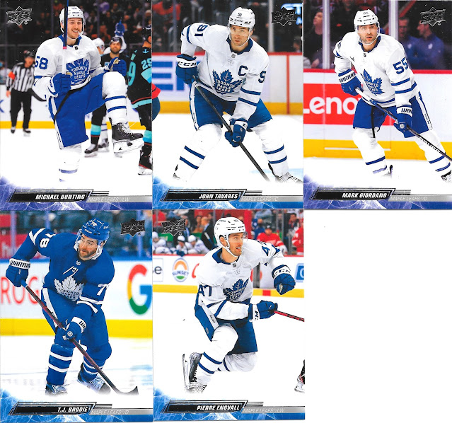
Today, some more hockey from Oren, and most is new to my collection.
I appreciate the simplicity of the design as the fronts are so photo focused, though I would have loved a little team logo maybe in the bottom right corner - big enough that it's noticeable, but small enough it doesn't detract from the card.
I will say, my other observation is that the colouring of the blue in the bottom design colour, definitely is an array of blue on the different cards, which will just be a printing/colour issue on the process. I am a bit surprised how noticeable it is, but that's a small complaint, and not really about the cards themselves, just what may be a change in process that should be fixed for next year.
The fact the border is team matched in colour more than makes up for the different hues that seem to come out in the printing.


No comments:
Post a Comment