Today, we have a trade that gave me a chance to change football cards into wrestling cards. Didn't have to ask me twice, so I sent off a package to TCDB member JBsSetCollection, and this is what I got back...
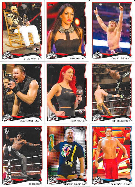
Topps using the same design as it did on baseball here, and I get to remember how long ago The Shield was, and Daniel Bryan being on top of the WWE world. Heck, back when Bray was a "rookie"! Also - Eva was never a wrestling prodigy but I do consider her the last holdover of Divas wrestling. She would have been great for mid-00s WWE...but happily those days are long gone.
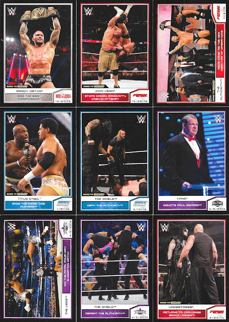
Not a big fan of the Road to Wrestlemania sets, especially this design because the parallels were simply having the "name" on the card a different colour. For example, one of these cards is a "black" parallel. Good luck!
If you want the answer...it's the last one. The name "Undertaker" is in black and not the silver foil. Talk about weak parallel. Now, if the entire border was reflective of it, I could get behind it.
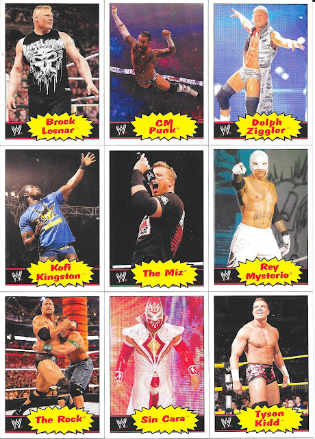
Last up, my absolute favourite set design for wrestling cards....
Collecting cards back in the 80s - this was THE design. I know I had some Hogan "rookie" cards from that set back in the day, that have long left my possession, but even this heritage re-take is bank on.
I do like the newer cardstock much better than the thinner flimsy 80s, but that's a small point.
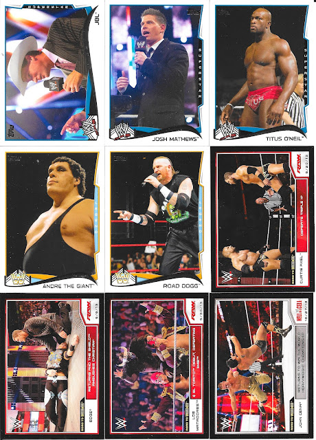
Heck, some of the cards would fit right in to the original design set from the 80s. Three sets with a decent boost of base set assistance - greatly appreciated!
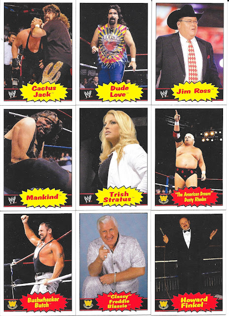
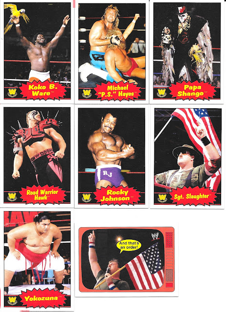
The 85T design is pretty cool. I also like the 87T design as well.
ReplyDelete